Become A Full Stack Developer
Escape The Ordinary
Code Your Way To FREEDOM!
Start your Web Development journey today with Code Success. Whether you're new to coding or ready to upskill, we provide flexible, career-ready courses that fit around your life. Sign up now for our Full Stack Developer Course or start with our Free Coding Taster Course!
Become A Full Stack Developer
It's not for everyone, but it could be for you! Why not try our Free Coding Taster Course. Just click here to give it a go!
- Learn By Doing
- From learning the basics to building real-world websites, you will learn to code using different languages that employers today crave!
- Put Your Learning Into Practice
- There are companies out there who need help building a website. You will work on actual websites that companies need, and use your skills to communicate and build their website.
- Help Finding Your First Job
- We work with the UK's top recruitment agencies to help you get your first job. Once you qualify, we put you in touch with our partner agencies so you can start earning and working.
Empowering Aspiring Web Developers
At Code Success, we go beyond just teaching you to code—we help you think and solve problems like a professional web developer. Our courses are designed to give you real-world experience from the start, helping you tackle challenges and collaborate on projects just like you would in the workplace.
We offer 100% flexibility, allowing you to learn at your own pace, no matter how busy your schedule is. You’re in control, but you’ll never feel alone. With support from our AI assistant, LeW-De, experienced mentors, and a collaborative Slack community, you’ll always have the help you need.
Our focus is on preparing you for real-world scenarios. From managing bugs to working with clients, you’ll gain the practical skills to succeed as a professional developer. When you complete our courses, you'll be job-ready, confident, and equipped for a career in web development.
Learning Partnership
Why Choose Code Success?
Our approach to learning is hands-on and immersive. We don’t believe in learning through endless theory—you’ll dive straight into practical projects that build your confidence and skills from day one. Every lesson is designed to give you experience with the tools, frameworks, and processes that professional developers use daily, ensuring you’re job-ready when you finish. Code Success is your gateway to a fulfilling and sustainable career in web development.
- Think Like a Pro
- We don’t just teach you the syntax—we teach you to think, adapt, and problem-solve like a professional web developer. You’ll learn how to handle real-world challenges, from fixing bugs to collaborating with clients, giving you the skills to succeed in any job.
- Real Projects, Real Companies
- Gain practical experience by working on live projects for real businesses. Build a portfolio that shows employers you can deliver high-quality work that meets real-world needs, setting you apart from other candidates.
- 100% Flexibility
- Our self-paced courses are designed to fit around your life. Whether you're working, studying, or juggling family commitments, Code Success gives you the freedom to learn when and where it suits you best.
<template>
    <div class="learn-journey">
        <h2>Your Code Success Journey</h2>
        <ul>
            <li>Master HTML, CSS, JavaScript & more</li>
            <li>Real projects for real clients</li>
            <li>Think like a developer</li>
            <li>AI & mentor support available</li>
        </ul>
        <button class="cta-btn">Join Us Today</button>
    </div>
</template>

<script>
    export default {
        name: 'LearnJourney',
    }
</script>

<style scoped>
    .learn-journey {
        font-family: sans-serif;
        text-align: center;
    }

    .cta-btn {
        background: #e76f51;
        color: #fff;
    }
</style>
Our Courses
Choose the right course for you
We offer a range of courses that teach you everything you need to succeed in web development:
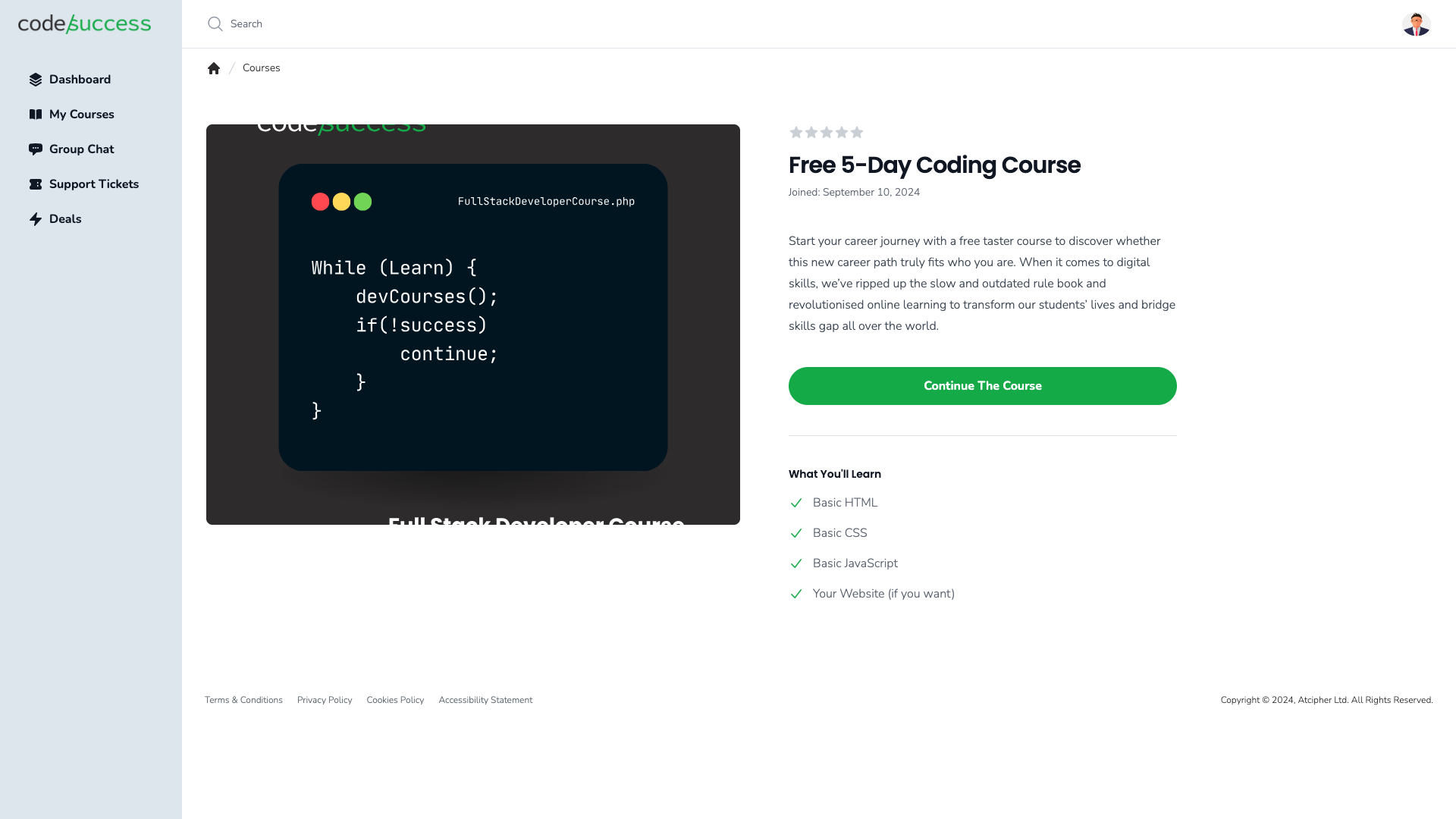
Free Taster Course
FREE
Not sure if Web Development is right for you? Try our free course and find out.
- Learn to code for free!
- Build a simple To-Do List Web Application.
- Self-paced, 5-day average, no experience required.
Full Stack Developer Course
£4,995 / one payment
Dedicated support and infrastructure for your company.
- HTML, CSS, JavaScript, PHP, MySQL, React, Symfony, Docker, and more.
- Duration: 9 months part-time.
- Build a web app with AI integration and an e-commerce store.
- Work on real projects with real companies!
- Support when you need it
Student Support
Support That Sets You Up for Success
Our students are never alone in their coding journey. We offer:
- AI Support with LeW-De: Your intelligent coding assistant, helping you tackle challenges in real time.
- Mentor Support: Get personalized guidance from experienced web developers.
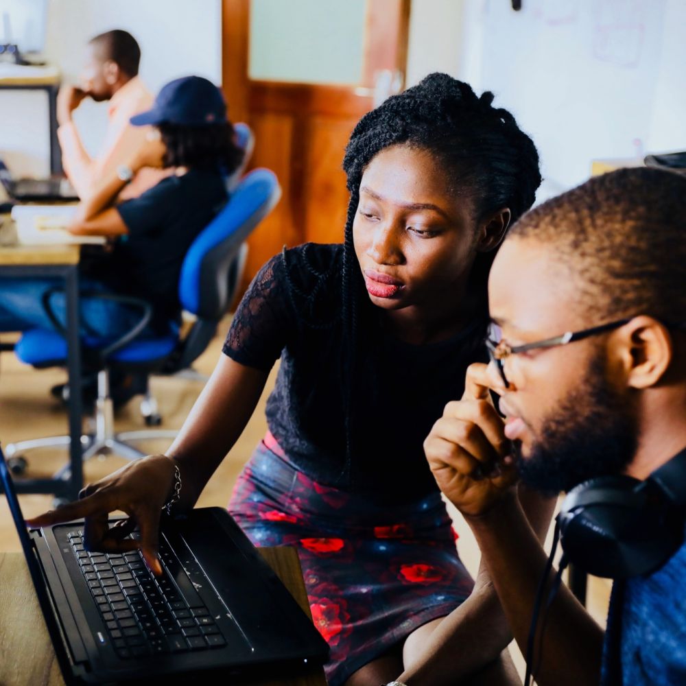
- Community Slack Channel: Connect with other learners, share your progress, and grow together as part of a supportive, collaborative community.

Real World Projects
Projects That Prepare You for the Real World
Our hands-on projects go beyond the code. You’ll work on developing real-world applications, giving you the skills to:
- Manage projects and meet deadlines.
- Tackle bugs and client requests.
- Communicate with managers and clients.
- Build a professional portfolio that showcases your expertise.
Start working on real projects today – sign up for the Full Stack Developer Course!

Coding Career Support
Kickstart Your Career with Recruitment Support
At Code Success, we’re not just teaching you how to code. We’re preparing you for a successful career. We’re building partnerships with top recruitment agencies to offer job placement support when you’re ready to hit the job market. Our students enter the workforce with:
- Professional CVs
- Portfolios ready for interviews
- Job-ready soft skills like communication and teamwork
Prepare for your future career – sign up today!
Contact Us
Have questions? We're here to help! Reach out to us anytime for more information on our courses or support.
What We Stand For
Our Mission
Our mission at Code Success is to empower aspiring web developers to become confident, job-ready professionals. We prepare students not just to code but to tackle real-world challenges and solve problems like a pro.
- Engaging Learning Experience
- Fun, challenging, and supportive.
- Self-Paced, Supportive Community
- Learn at your own pace, but never alone.
- Real-World Problem Solving
- Become a problem-solver, not just a coder.
- Inclusivity
- We welcome everyone, regardless of background or experience.
- Student Success
- Our goal is your confidence and career success.
Our Values
Frequently asked questions
- What is Code Success?
Code Success is an online training platform that offers self-paced courses in web development. We teach you not only how to code but also how to think like a professional developer, preparing you for real-world challenges and career success.
- What courses do you offer?
Our main offering is the Full Stack Developer Course, which covers everything from HTML and CSS to advanced topics like PHP, React, Docker, and APIs. We also offer a Free Coding Taster Course to get you started with no commitment.
- Who are these courses for?
Our courses are designed for beginners with no prior coding experience, but they are also suitable for those looking to upskill or switch careers. Whether you're new to tech or have some coding knowledge, you’ll find the right course to help you reach your goals.
- How long does it take to complete the Full Stack Developer Course?
The Full Stack Developer Course is designed to be completed in around 9 months part-time. However, since the course is self-paced, you can finish it faster or take more time depending on your schedule.
- Do I need any special software or equipment to start?
You’ll need a laptop and an internet connection to get started. For the Free Coding Taster Course and Full Stack Developer Course, we guide you through setting up industry-standard tools like Visual Studio Code. We also provide a gift pack that includes essential tools like a Raspberry Pi 5 for students who sign up by the end of 2024.
- What kind of projects will I work on?
You’ll work on real-life projects for businesses, such as building web applications and e-commerce stores. These projects give you hands-on experience and create a professional portfolio that you can showcase to future employers.
- How does the support system work?
Our students have access to multiple layers of support, including AI support via LeW-De, mentor guidance, and a Slack community where you can collaborate with fellow learners. We’re committed to helping you every step of the way.
- Is there any job placement assistance?
We are building partnerships with top recruitment agencies to help our students secure jobs after graduation. You’ll receive help with creating professional portfolios, CVs, and interview preparation, ensuring you’re ready for the job market.
- Are there any discounts or special offers?
Yes! Sign up before the end of 2024 and you’ll receive an exclusive gift pack, which includes a Raspberry Pi 5, a self-stirring mug, coffee from Coaltown Coffee Roasters, and more. Plus, starting in January 2024, we’re offering a 35% discount on all courses for the rest of the year.
- How do I sign up?
You can sign up directly through our website. Choose the Full Stack Developer Course to begin your web development journey, or try our Free Coding Taster Course to get a feel for learning with Code Success. If you have any questions, feel free to contact us for more information.
Sign up today
Don’t wait – take the first step toward your new career. Sign up today for the Full Stack Developer Course or try out the Free Coding Taster Course!